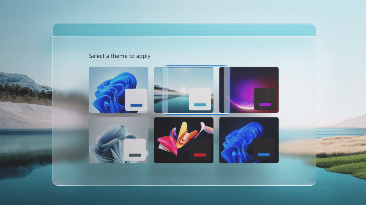
What is Flat Web Design and why is it important?: Flat design is a style of interface design emphasizing minimalist use of simple elements, typography and flat colors.
Designers may prefer flat design because it allows interface designs to be more streamlined and efficient. It is easier to quickly convey information while still looking visually appealing and approachable.
Additionally, it makes it easier to design an interface that is responsive to changes in browser size across different devices. With minimal design elements, websites are able to load faster and resize easily, and still look sharp on high-definition screens. As a design approach, it is often contrasted to skeuomorphism and rich design.
Flat websites are minimal and require sans serif fonts with the right combination of colors. If your website has too many colors, the wrong font or even a photograph it can easily destroy the flat design you are going for.
The color chart I might be using is found HERE.
With hand held device use on the rise, and bandwith/data usage at a premium, it might behoove us to write simpler and lighter. The minimalist approach to website design assists the device user greatly in helping to curb data use and time as pages generally load much faster written with minimalist in mind.
A more common complaint about the flat design model has been it’s lack of aesthetics. Windows 7 for instance was released with what I like to call heavy graphics. Graphics that were found lending themselves to the more skeuomorph or rich design (eye candy for short).
By contrast, the Linux Mint Cinnamon 18 build was released with flat elements by design. People often cited the Linux build being uglier than it’s Windows counterpart because of the graphics. The Linux build however, was much lighter and consumed less resources because of it’s designed minimalist approach.
To see an even more striking example of rich design verses a flat design, all you have to do is look at Windows 7 and Windows 10 side by side. Microsoft had finally come around to the Linux way of thinking when it decided, for the sake of used resources, that a flat design would be better for it’s GUI (graphical user interface).
Flat design has virtually eliminated the shadow element from any number of graphics.
I am not necessarily an avid proponent of flat design, but I do accept the concept to various degrees and code accordingly.
There are those however that might be somewhat critical of the flat design concept. In 2013 Jakob Nielsen, an expert in user interface design and usability, dubbed flat design as a “threat to tablet usability”.
Even though the Nielsen group conducted research in 2017 that found the use of interfaces using flat design to be 22% slower on average, I still believe that flat design still has it’s place.
There’s an old saying in the industry with regard to “less is more”, and if you’re in an industry that’s highly competitive where the margins are thin, one might do well to have a web development solution that loads light and fast. Flat web design definitely has it’s place in these, and many other areas.


Leave a Reply
Your email is safe with us.
You must be logged in to post a comment.